Bringing Color To Life
Brands convene people in many ways and around many different causes. But what about colors? In a more traditional design framework, color is deployed for emotional and symbolic purposes. So, for example, red can ignite fiery emotions, while blue tends to calm. Green has come to symbolize nature and the environment, black often means edgy and hip. On a conceptual level, the meaning of colors, much like words or other signs, are essentially arbitrary and, at times, may be contradictory (e.g. green has come to stand for environmentalism, as well as greed!).
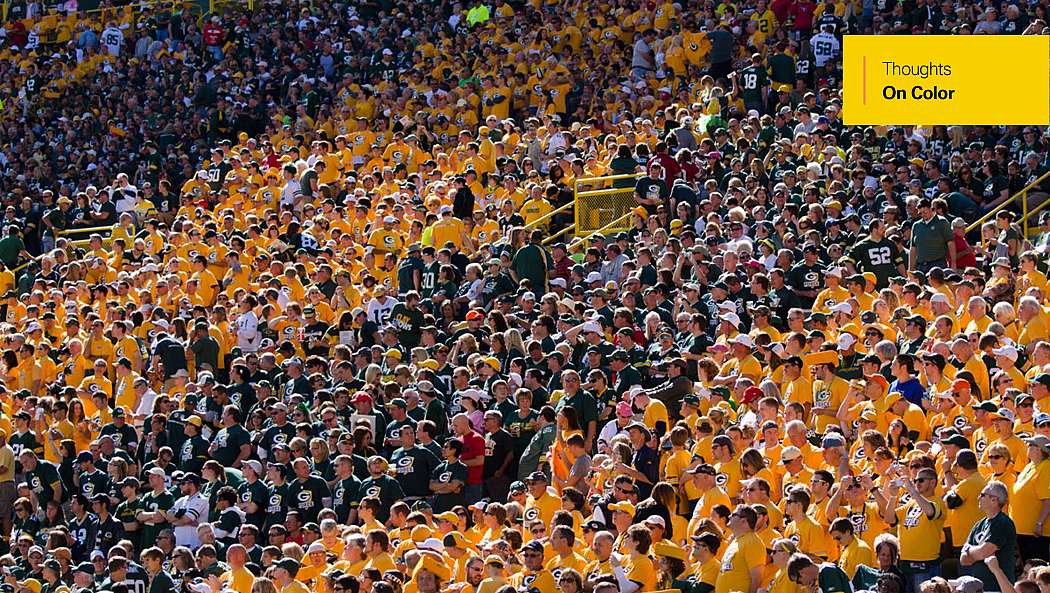
Color, however, can generate the Power to Convene when it becomes used as a kind of badge of membership or a marker of identity. Combine a pure black with orange Pantone 165 and you’re communicating that you’re part of the Harley-Davidson tribe. If you live in Texas, people may identify your alma mater’s brand based on the custom color of your vehicle: A&M maroon or UT burnt orange. In communist era Poland, dissidents could often identify one another by discretely wearing red socks. And many notorious street gangs have become associated with specific colors, like a tribal marking.
Color is often deployed as a social glue, one more thread that can connect people together in a common bond.
In these disparate cases, community connection and identity building takes precedence over any potential meaning of a color. And at the same time, the perceived or collective meaning of the color continues to play an important symbolic role in building momentum for the movement. Color is often deployed as a social glue, one more thread that can connect people together in a common bond. In this blog post, we consider a few more examples and then relate it to potential brand-building efforts.
COMMON THREADS
In the early 20th century British suffrage movement, Emmeline Pethick-Lawrence initially chose three colors to unify participants for a march in London’s Hyde Park: white for purity, purple for dignity and green for hope (replaced by gold in the US suffrage movement). In June of 1908, approximately 30,000 women marched on Hyde Park, all wearing long white dresses and skirts. The common white apparel showed bystanders and politicians that the group was well-organized and cohesive, a force to be reckoned with. It created a genuine bond between participants.
The psychology of the color white was strategically deployed by the woman’s suffrage movement. White is the absence of color, and is typically read as pure, clean and innocent. It is what exists before the rest of the world complicates things. Ms. Pethick-Lawrence knew that a single color would create an appearance of cohesion and unity, but she also wanted this group of thousands of women to stand apart from the dirty and corrupt system they were protesting. White casted the protesters as innocents, pure of heart.
WAVE THE FLAG
For the Lesbian, Gay, Bisexual, Transexual and Queer community (LGBTQ), the rainbow flag has become a symbol of “pride.” But how and why? Gilbert Baker, the artist and drag queen who created the rainbow flag in 1978, wanted to represent an entire nation of people. He viewed the community as a community that could proclaim its power.
A community united to create something as beautiful as the rainbow.
Throughout history, various colors have been used to identify gay people, typically among other members of the community. In 19th century England and France, a green carnation in the lapel subtly communicated sexual orientation. In Australia, people wore yellow socks. In the United States, they often dressed in purple or lavender. Unfortunately, these color codes were in response to a social requirement for the gay community to be discrete in their culturally stigmatized behaviors and lifestyle.
As a way to claim power over the LGBTQ community’s identity and to do so openly and publicly, Mr. Baker chose to create a flag. This very public communication form was initially made up of colors with specific symbolic intent: pink for sex, red for life, orange for healing, yellow for sunlight, green for nature, turquoise for art, indigo for harmony and violet for the human spirit. The rainbow of colors also symbolized the diversity of the LGBTQ community, where all genders, races, ages and backgrounds were welcome. This is a community united to create something as beautiful as the rainbow. The result is a near universally recognized symbol for gay pride. The rainbow flag has become a tool in the movement’s cause to demand rights and protection for the LGBTQ community.
Alongside the LGBTQ community’s rainbow flag is an equally color-coded symbol, the pink triangle. In Nazi Germany, pink triangles were required as a concentration camp badge to identify male prisoners sent there because they were gay—and these men were not necessarily Jewish, either. Despite this terrible history, by the end of the 1970s, the pink triangle was adopted as a symbol for gay rights protest. In a surprising turn, the pink triangle actually became a symbol of empowerment, turning a stigma upside down by sticking with this bold pink color.
SEEMINGLY TRIVIAL ACTS
In the recent past, there have been a number of cause movements using colors to raise awareness through small gestures. Yellow ribbons tied around front yard trees were used in the 1970s to show support for American hostages in Iran, also in the 2000s to support troops in Iraq. And these ribbons, large or small, have been worn to support a wide range of disparate causes around the world.
“Wearing a specific colored shirt might seem like a trivial act, but the meaning behind it is significant."
One recent US-based awareness campaign involves people wearing red clothing on Fridays to “Remember Everyone Deployed.” The R.E.D. mission visibly demonstrates solidarity and support for American troops, while also reminding others that Americans are currently serving in many places around the world right now. The R.E.D. campaign is similar to the common colors of the suffrage movement wearing white, but the unique twists are that R.E.D. asks people to wear red every Friday, as well as seeking to spark an imaginative connection to these thousands of deployed troops spread out around the globe. While it’s relatively easy to read about troop movements in the news, R.E.D. wants to develop more personal and empathetic considerations of how official events and presidential decrees, like delaying a planned troop withdrawal, can directly impact the lives and families of individuals. In the words of one R.E.D. organizer: “Wearing a specific colored shirt might seem like a trivial act, but the meaning behind it is significant. It translates to mean that as you prepared for your day, you recognized that others are playing an active role to allow you to go to work or class with relative peace of mind that you are safe.” In turn, the people wearing red on Fridays don’t often speak loudly about their cause, but certainly share a sense of common remembering with others in their community.
BEYOND IDENTITY
What’s interesting about all of these cases is how these movements seek to use colors as tools to build their cause. They’re not waiting around for people to gain a deeper understanding of color psychology. They actively employ colors to build community. Through everyday rituals, like wearing common color clothes or waving a flag, communities come to identify with their causes, which helps build their movement. The colors are not static signs, they are brought to life, and sometimes repossessed or re-appropriated. The “seemingly trivial” acts of wearing a color t-shirt or hanging a flag becomes a gateway to discovering new identities or a new awareness of the world.
Of course, we want to tie this back to how brands use colors to convene—or not. And while color choice is typically just one piece of a larger brand strategy and brand identity, these social movement examples might help brands think about the wide variety of ways that color could be emphasized to make a point, shape common identity or remind people of a cause in the course of their everyday lives. A commercial brand’s cause may not have the cultural or political value of what these social movements are trying to change in our world, but they nonetheless swim in the same symbolic ocean.
So, for some brands, the use of color, or colors, are a subtle way to create instant identification. Like Gucci’s signature green-red-green stripe pattern. Paul Smith has a now famous bright pink building on Melrose Avenue in Los Angeles, that people come to visit and take photos at. Apple kind of (re-)introduced the world to Rose Gold, which has also become associated as “Millennial Pink.” Other big brands have more closely identified with colors in their advertising over the years, including IBM, often known as “Big Blue.” And UPS garnered attention in their advertising campaign a few years back, referring to themselves simply as “Brown.”
Now, imagine: If your brand couldn’t use words to articulate what it stands for and chose not to employ images or even a logo either, would people care to pay attention? If you could distill your brand to one color or simple color pattern, what would that be? If you could fly a flag, would it have meaning for anyone? Would your colors impact our everyday lives?