- You have not saved any projects.
Gelson's
Gelson’s has always had a reputation as a pioneer and innovator—for example, they were the first store to bring Wolfgang Puck cafes on-site and have continually debuted the most cutting edge CPG startup brands. But as innovation requires partnerships, Gelson’s turned to Shook Kelley to help evolve this great brand.
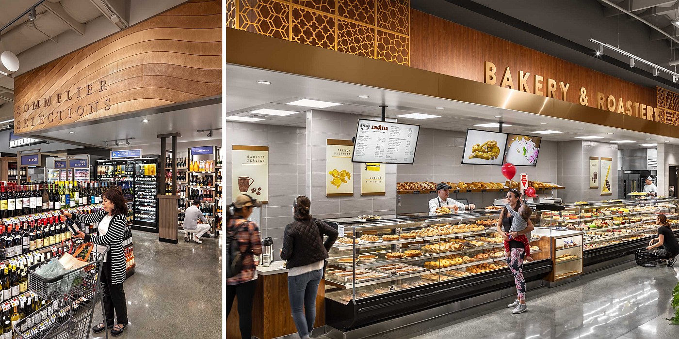
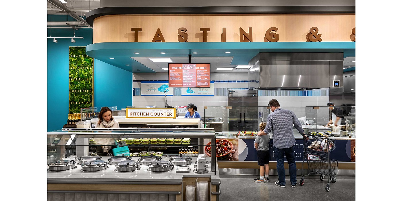
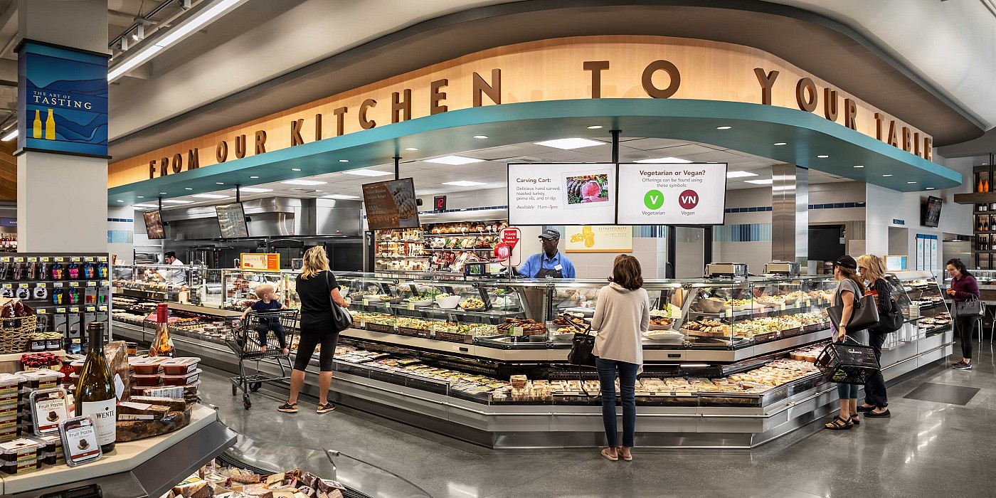
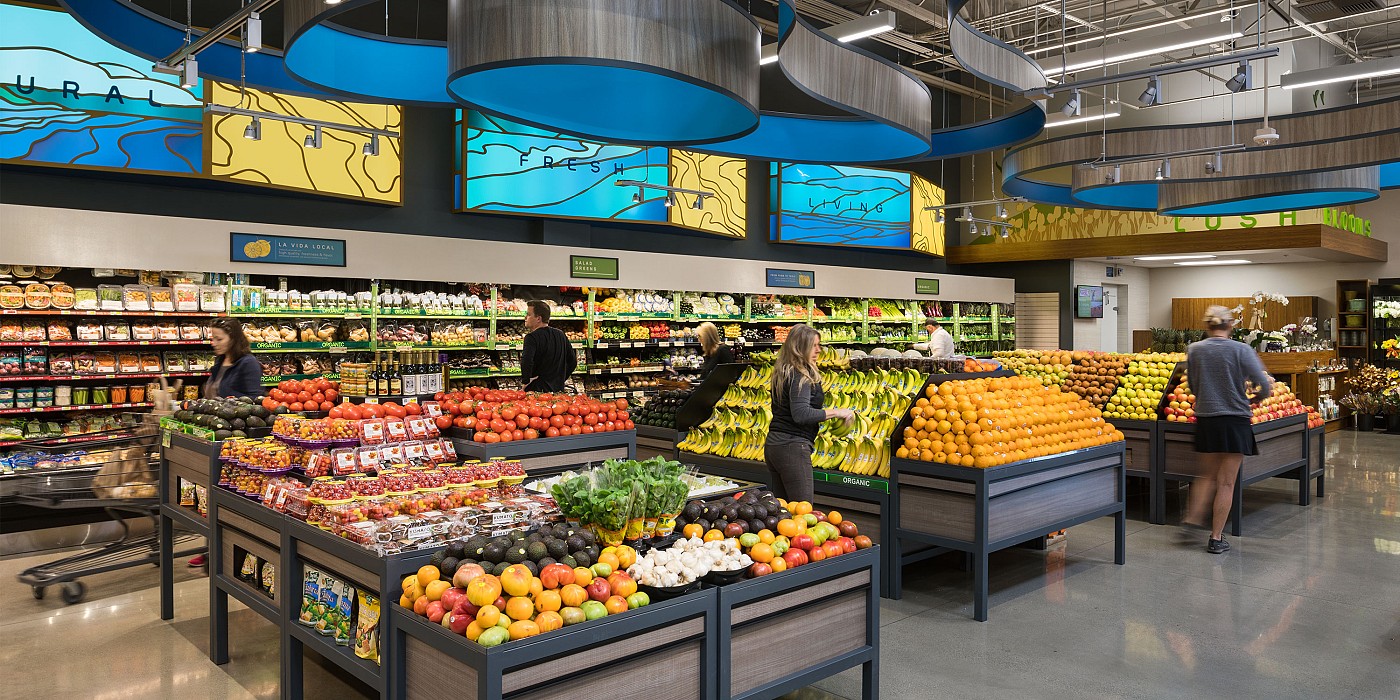
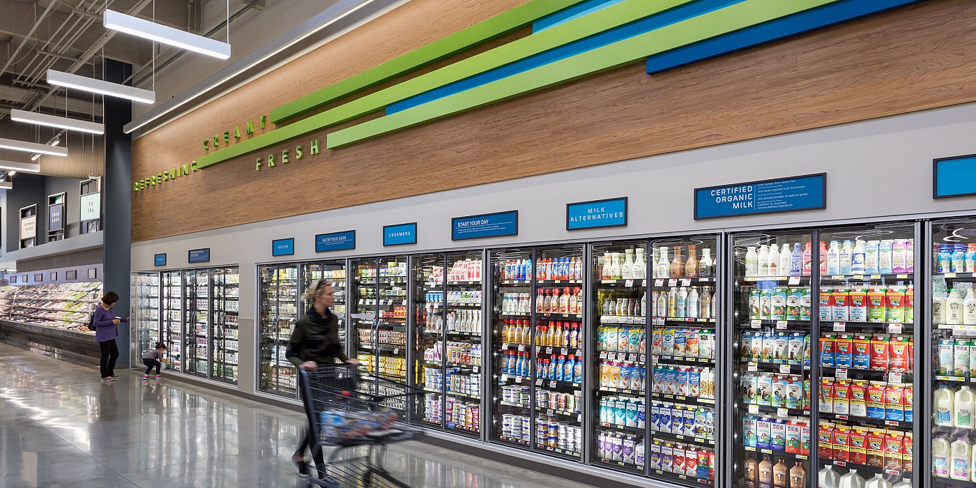
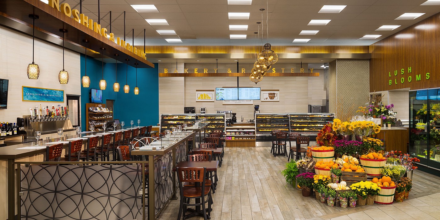
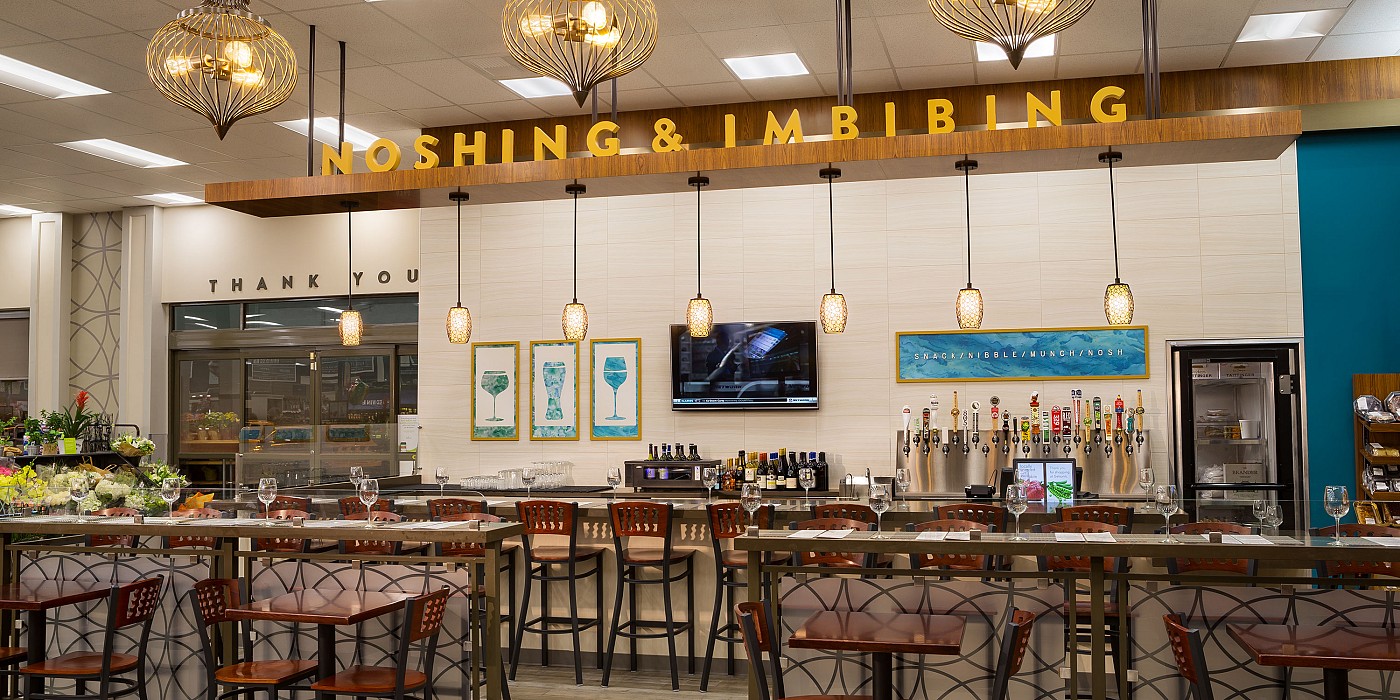
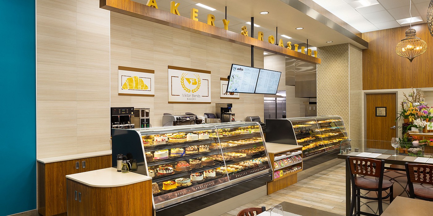
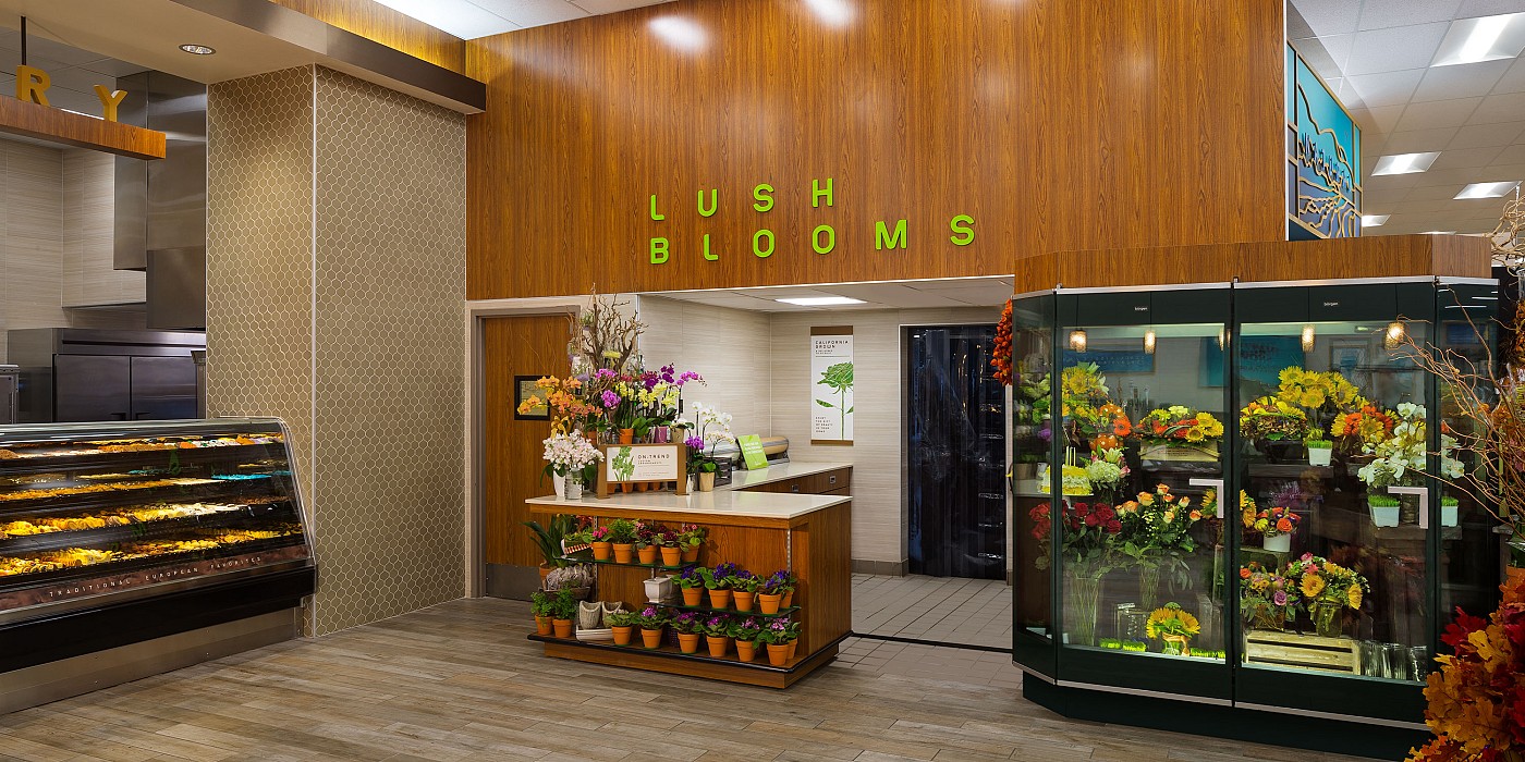
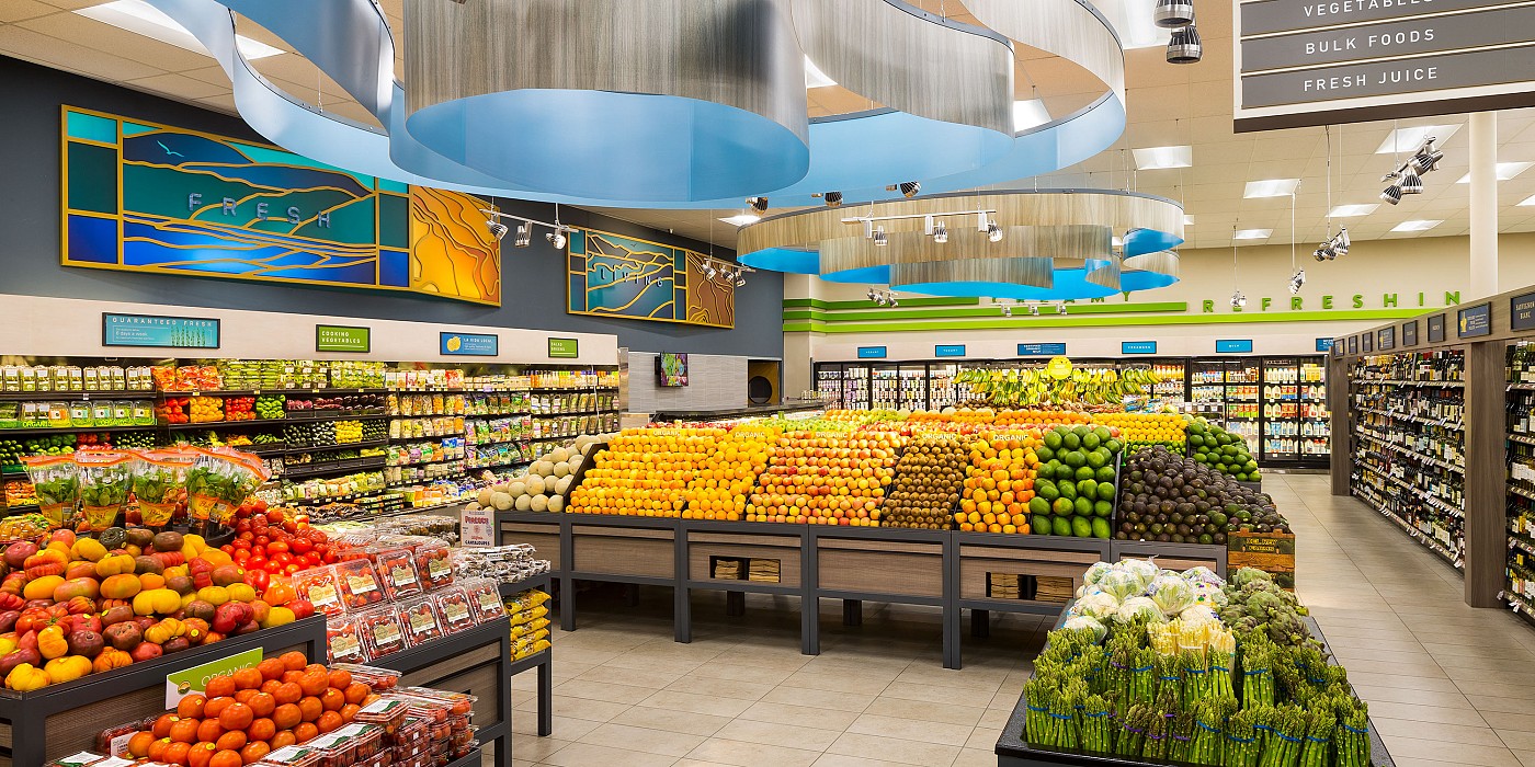
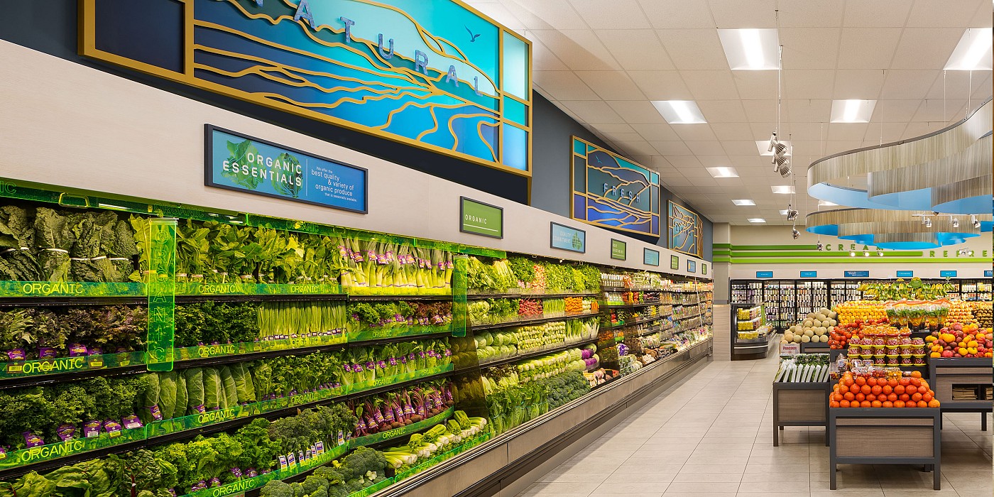
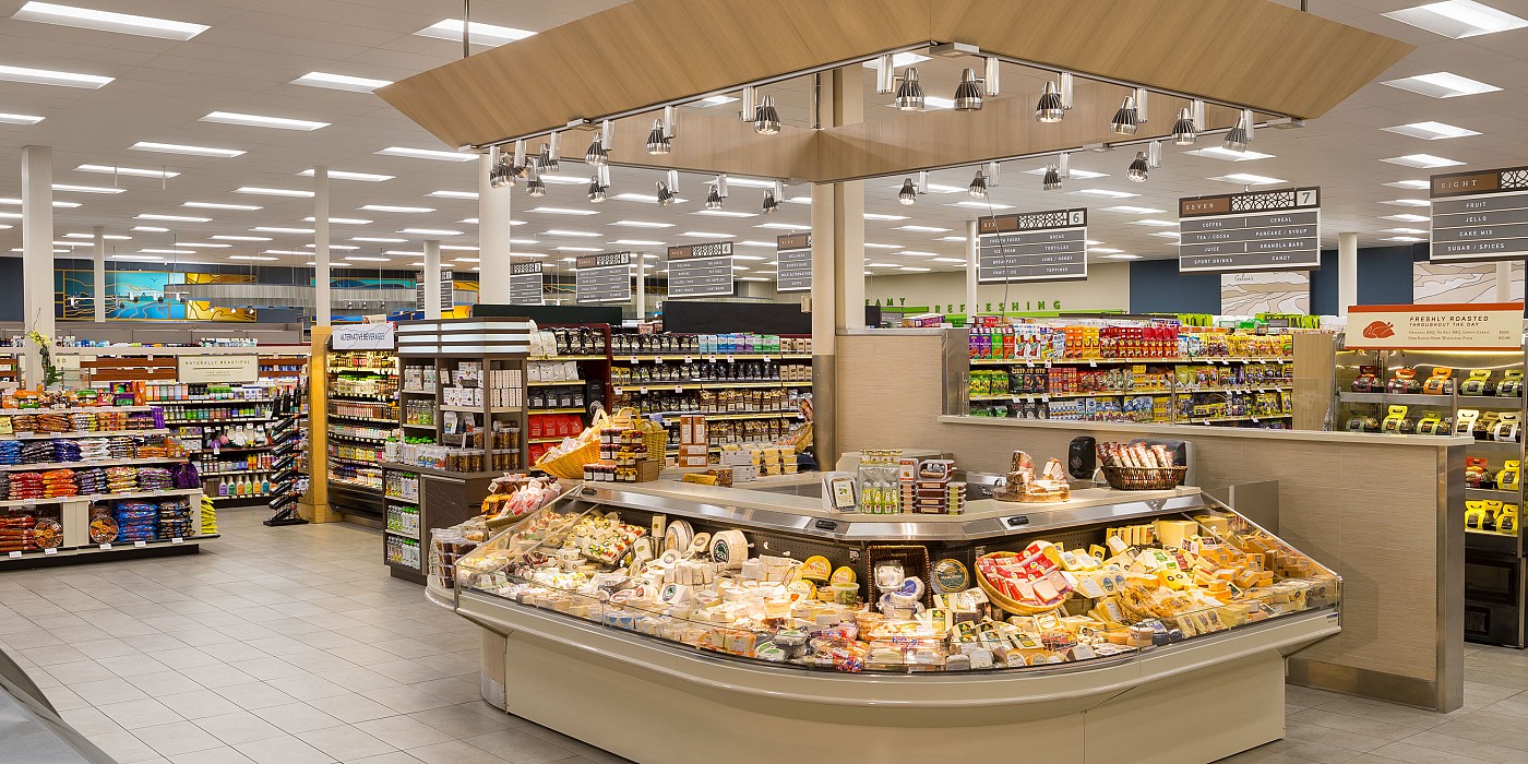
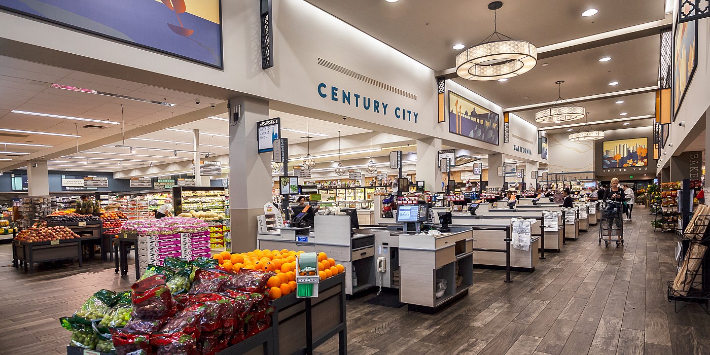
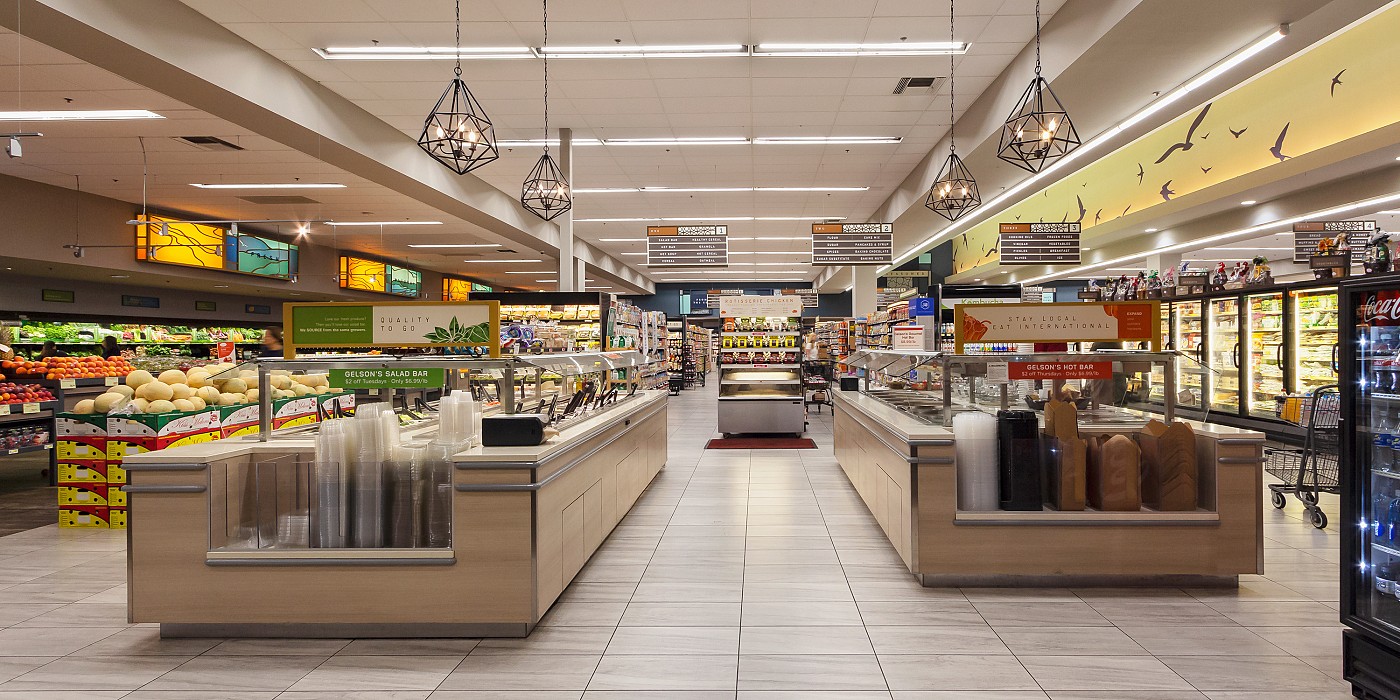
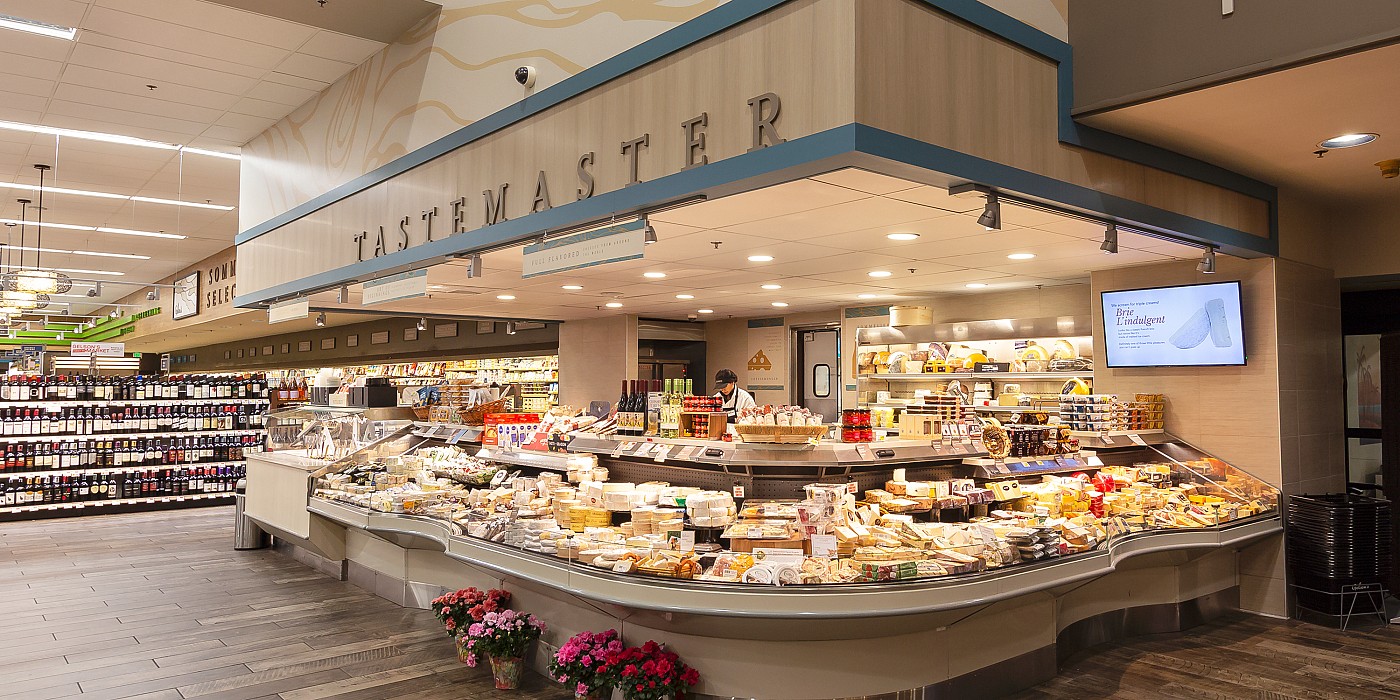
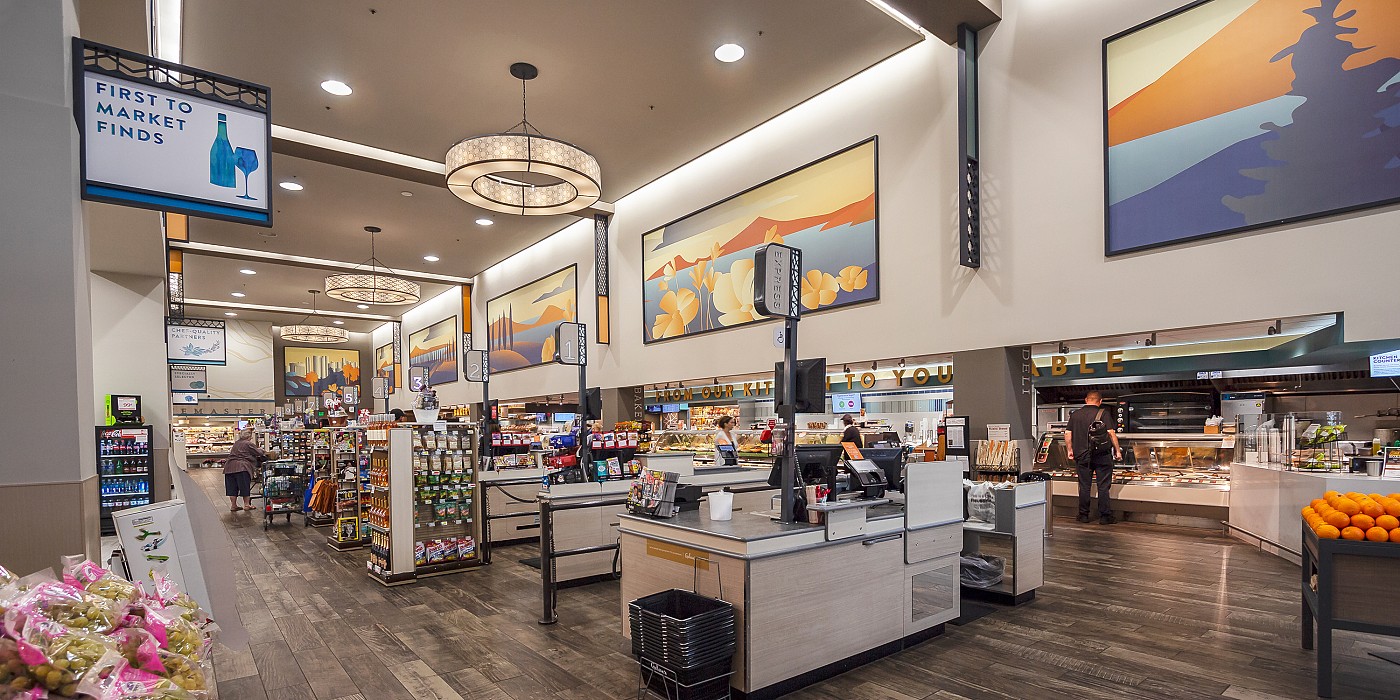
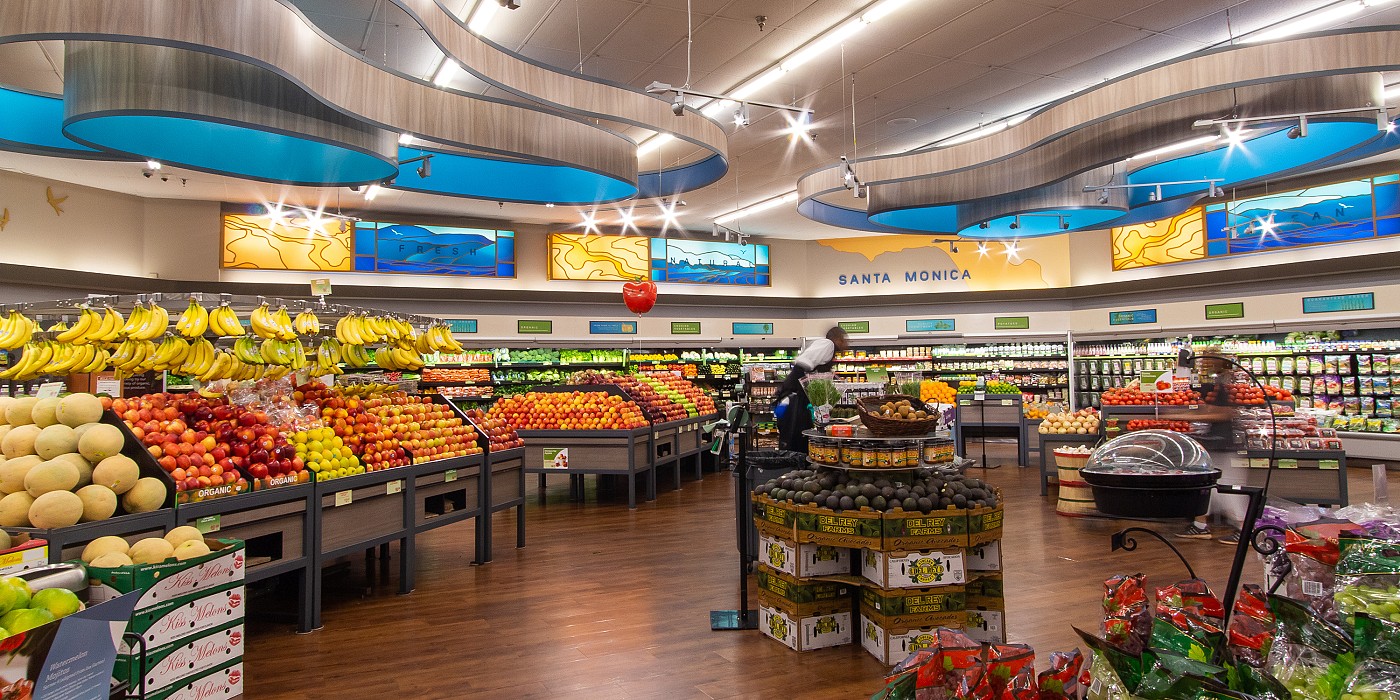
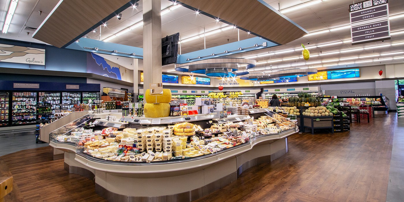
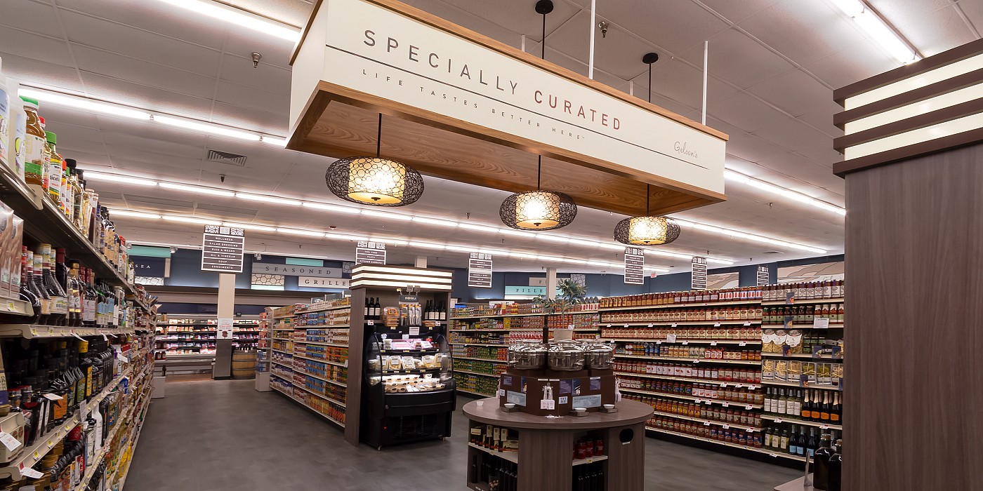
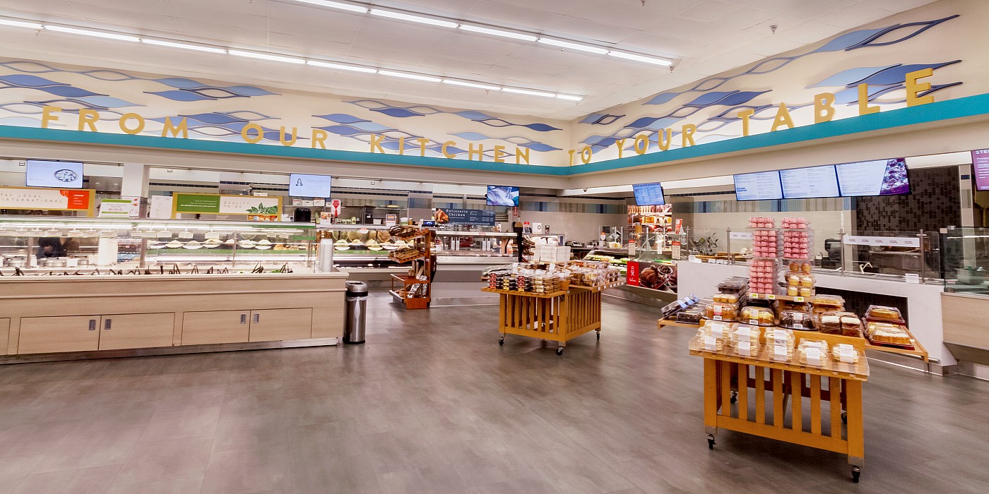
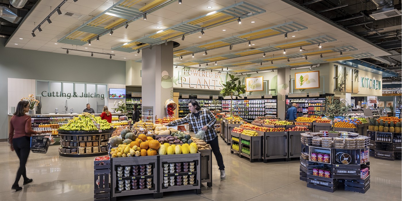
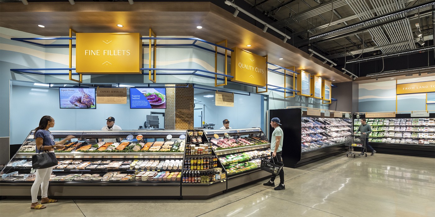
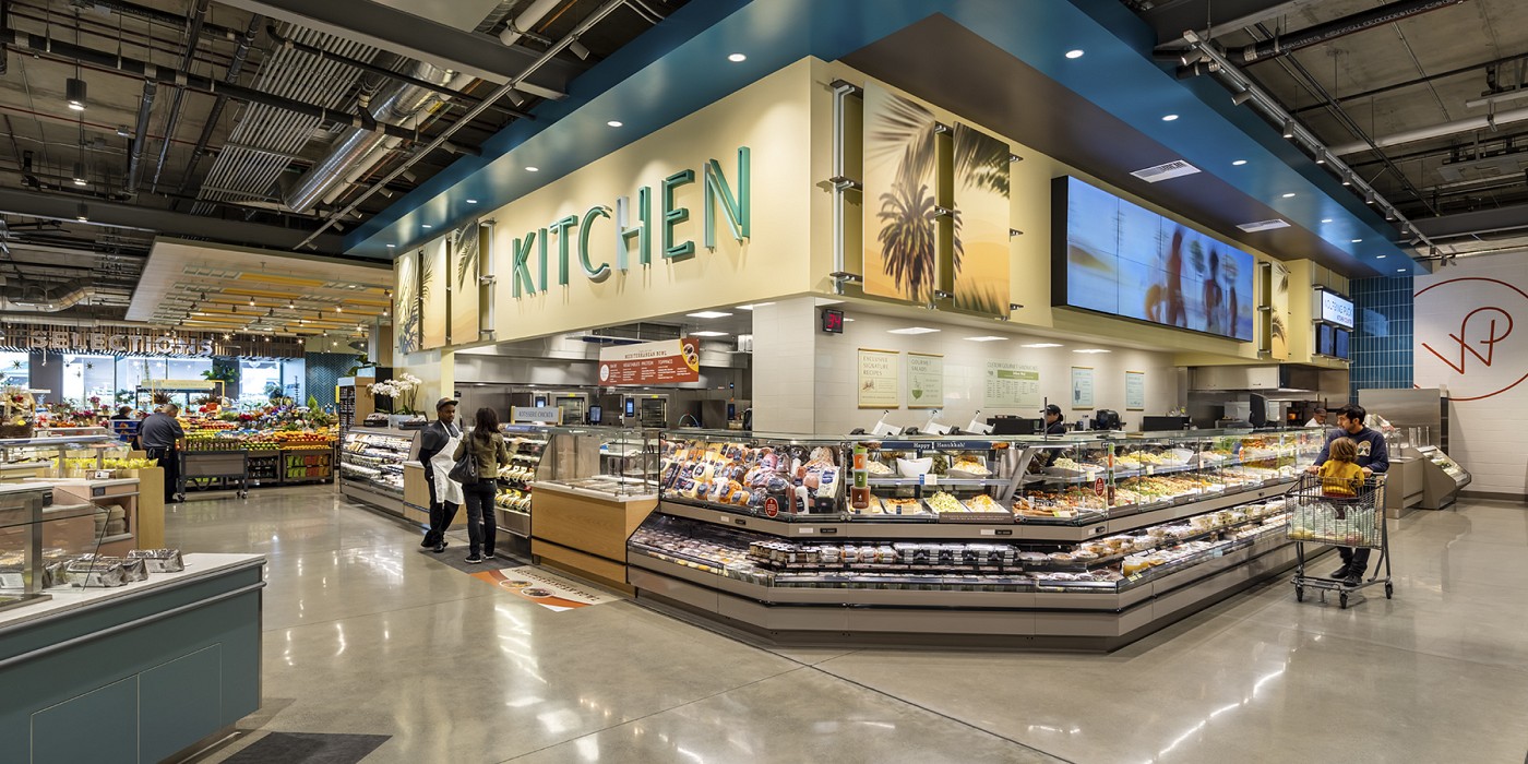
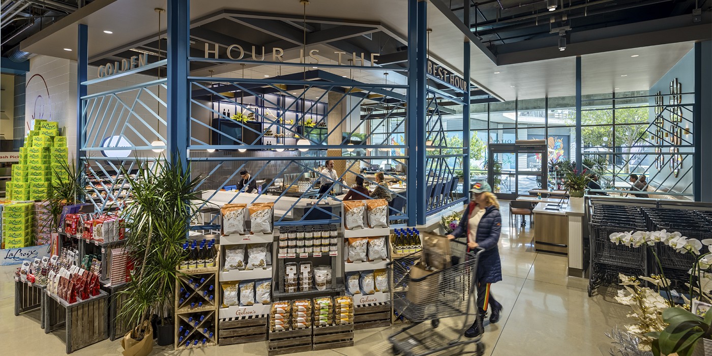
Gelson’s Market is a premium food retailer with locations throughout Southern California. Founded in Burbank by Bernie Gelson in the 1950s, the brand has long catered to the more refined tastes of Angelenos. In recent years, as Gelson’s sought to expand, food culture has evolved and a slew of new competitors have emerged. As a result, Gelson’s competitive advantages have become less clear.
The Gelson’s brand identifies closely with a specific slice of Southern California food culture and coastal lifestyle.
Over the course of several months, Shook Kelley dove into the Gelson’s Market brand in great depth. The Gelson’s brand identifies closely with a specific slice of Southern California food culture and coastal lifestyle. Gelson’s is an aspirational place, that is also accessible and service-oriented. Gelson’s strives to offer a truly exceptional store experience, a balance of foodie indulgences and everyday food solutions. While welcoming service is a hallmark of the brand, Shook Kelley also helped Gelson’s recognize that they’re not necessarily the destination for everyone. Renewing the brand’s focus on certain consumer segments helped the organization refocus on its unique competitive and strategic advantages.
Shook Kelley used this Discovery and Strategy work to help guide a new store design in Manhattan Beach, a series of store renovation projects throughout Southern California and a redesign of the Gelson’s Market brand identity. Additionally, Shook Kelley has worked closely with Gelson’s leadership on a number of internal brand culture building programs to communicate the brand’s unique perspective to team members and to integrate the brand’s values into decision-making processes at all levels.
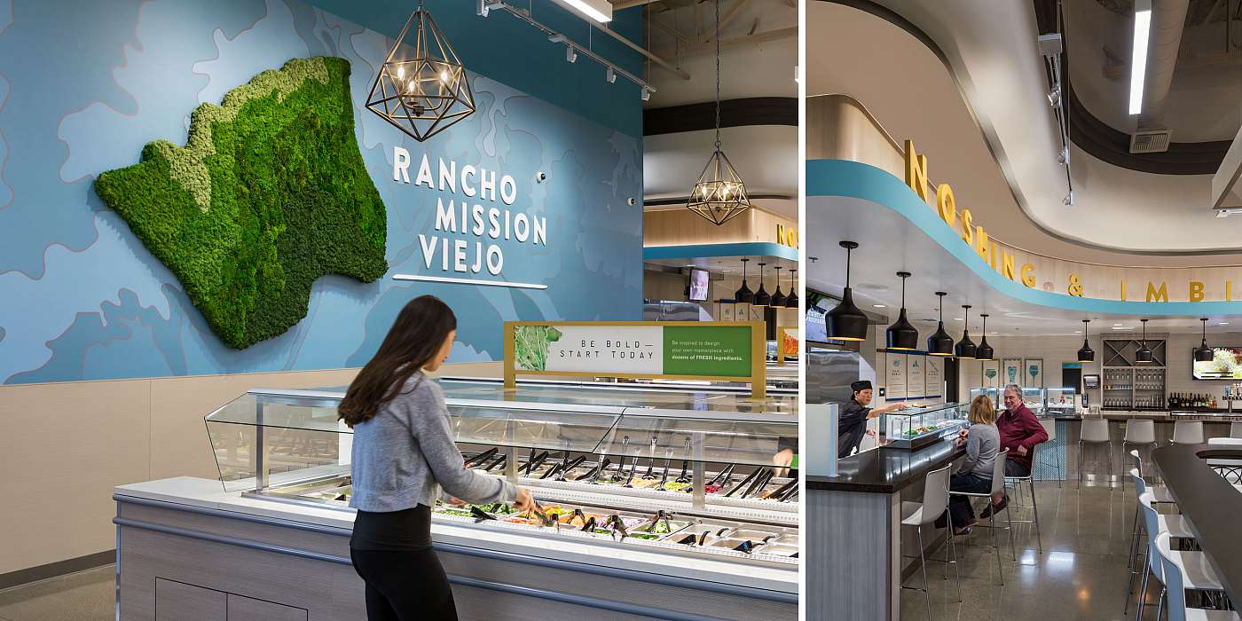
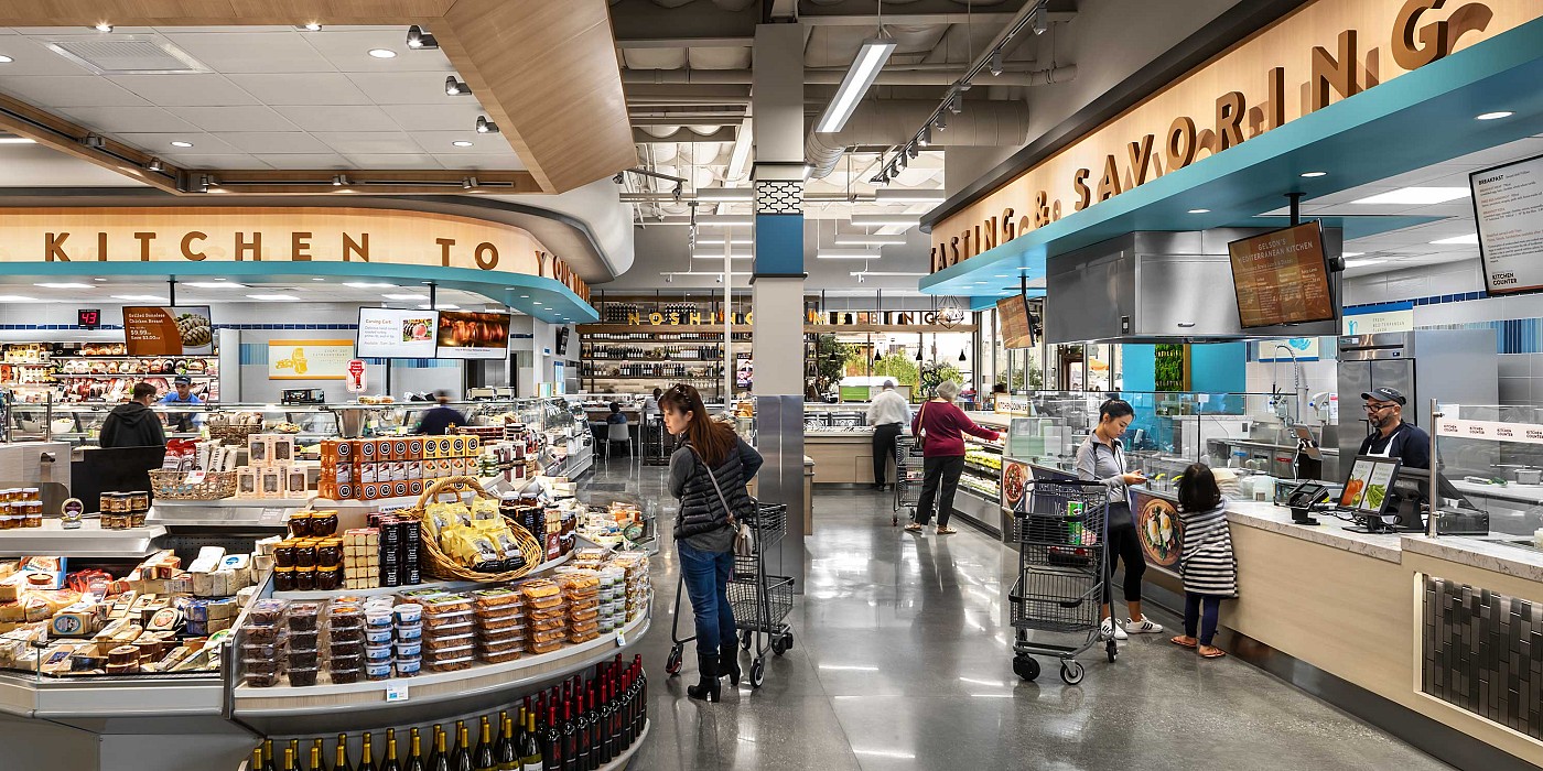
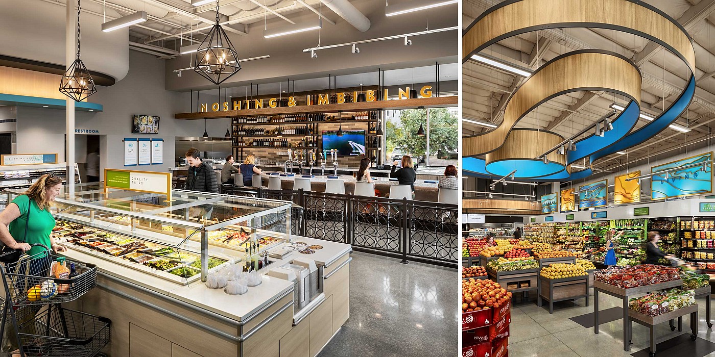
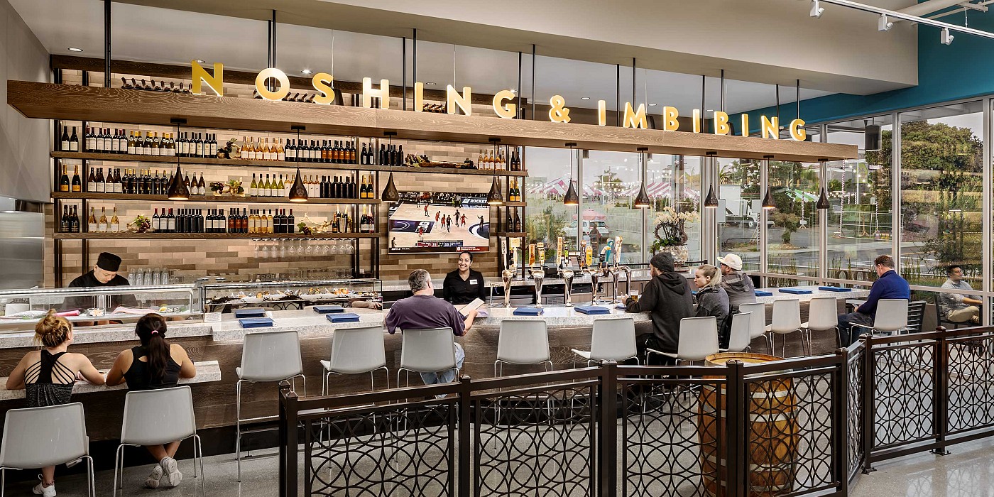
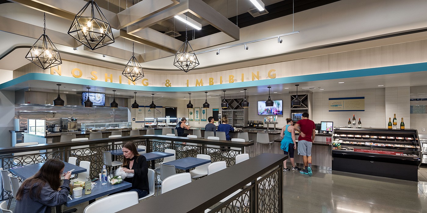
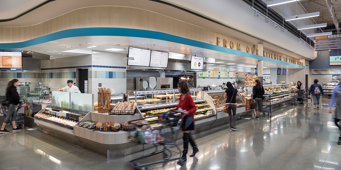
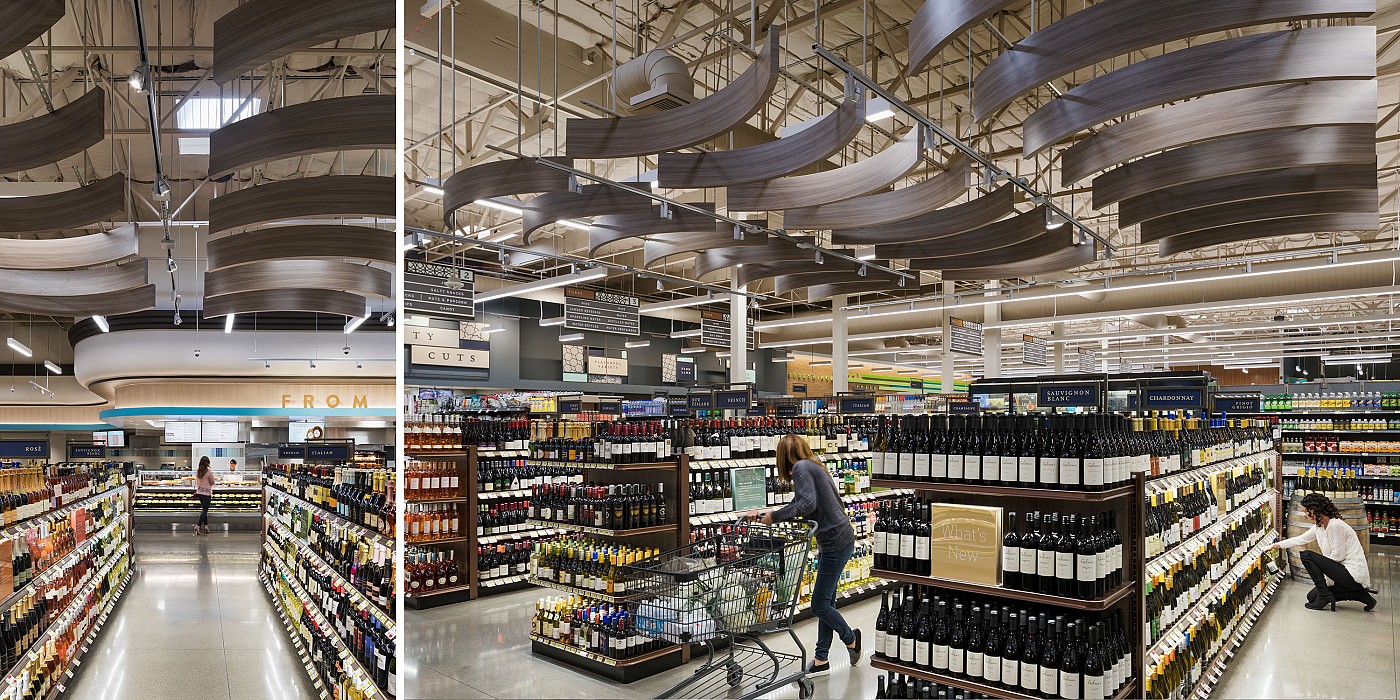
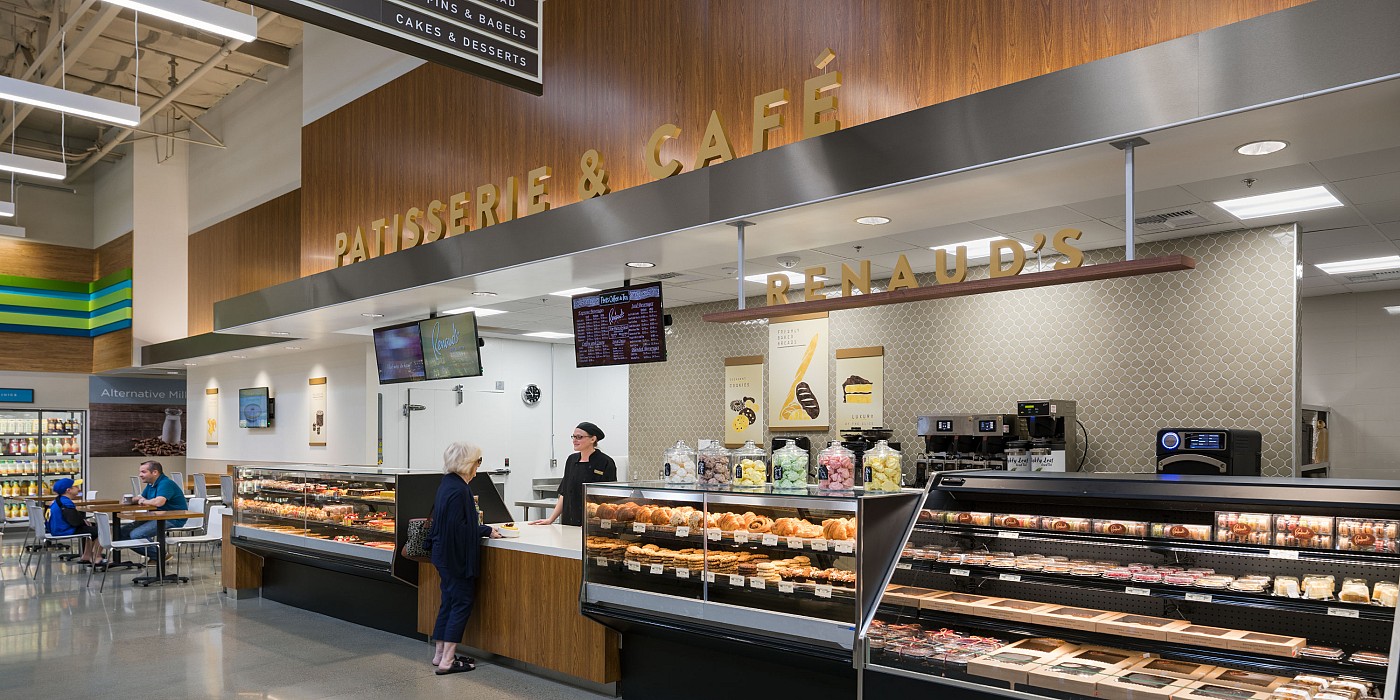
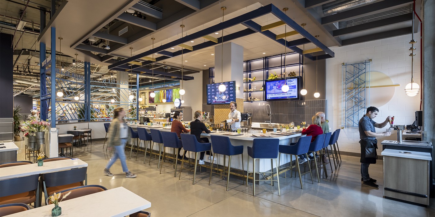
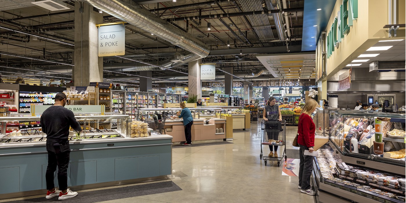
The new Gelson’s Market in Manhattan Beach emphasizes the brand’s philosophy and progressive approach to food. The location features a food hall-inspired experience with a lineup of a wine and tapas bar, a seafood and raw bar, made-to-order Mediterranean bowls, a roasted meat carvery offering, signature Wolfgang Puck salads, sandwiches, and pizzas, and Gelson’s Market’s-crafted deli salads and sandwiches. The store also features olive oil, kombucha, and cold brew “on tap.”
The Visual Communication strategy in the stores aims to express Gelson’s brand experience while providing opportunities for social activity, taste exploration and food discovery.
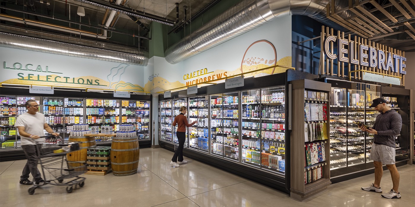
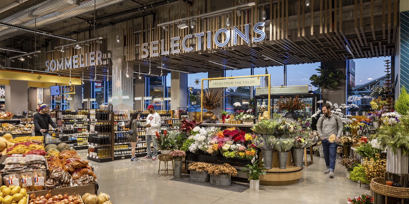
A series of redesigned existing Gelson’s Market stores also redefines the shopping experience, by creating a context that shares the brand’s story, perspective and editing philosophy. In these stores, redefined food service areas enhance and communicate Gelson’s passion for food, including many of the same special featured food zones found in Manhattan Beach. At the Silver Lake location, the store’s new wine bar has garnered a lot of attention as a destination where customers can be part of a community experience. The publication LA Weekly even called it the city’s best new bar.
At the new West Los Angeles location, the store is located in a mixed-use development, with a built-in on-site audience of professional creatives and tech workers from the office above, on-site residents, and other food and retail consumers. The neighborhood itself is more dense, with younger and a more progressive audience than Gelson’s typical suburban marketplace. Aligning with, appealing to, and reflecting this audience’s lifestyle was a key shift for the brand. The new West Edge store captures a warm, airy, sunny, effortless California vibe that aligns with the core brand, while also feeling current and locally-specific.
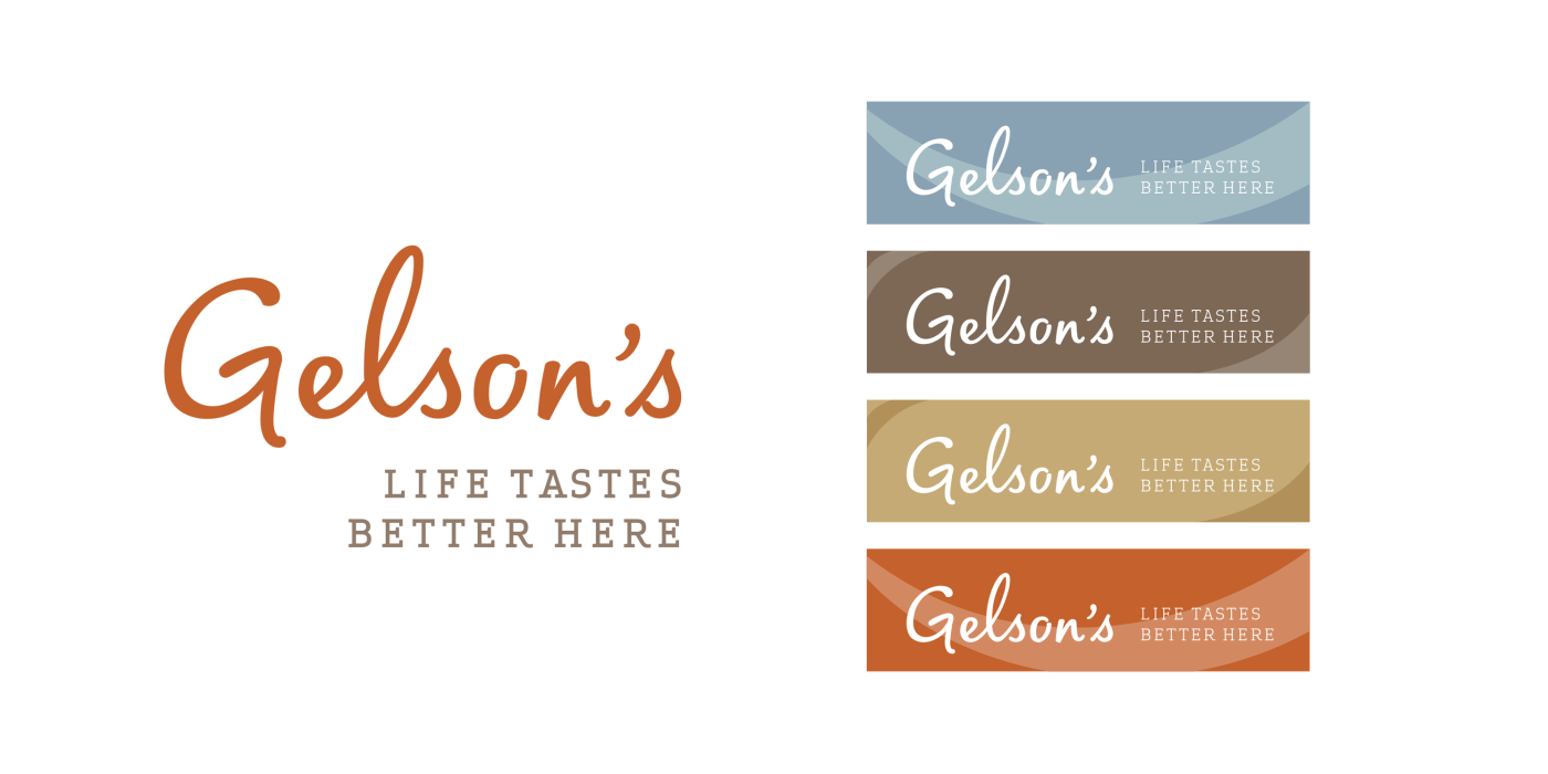
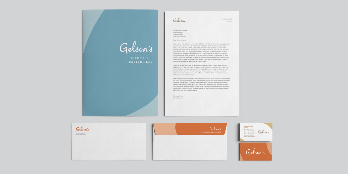
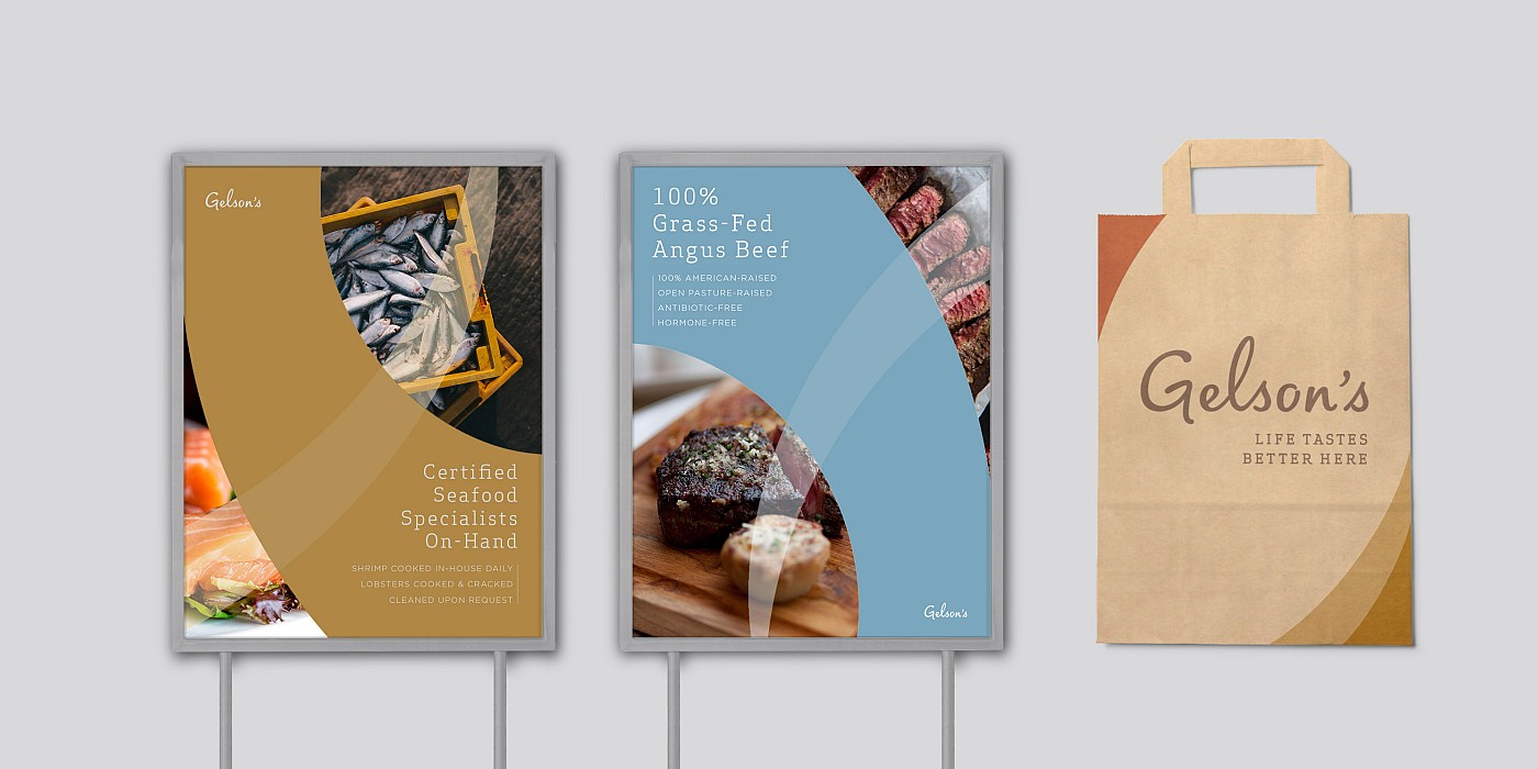
To further evolve the brand, Shook Kelley redesigned the Gelson’s Market brand identity, which is now featured in the new and redesigned stores. The new Gelson’s logo taps into aspirations of an easygoing, natural and relaxing way of living. The overall identity leverages a four color palette, all inspired by California land and skyscapes, such as the roof of Mediterranean-style homes across a city, a sea of palm tree trunks and the meeting of ocean and sand on the beach. The identity’s new type is a modified hand drawn typeface that represents a specifically California-based aspirational sense of ease.
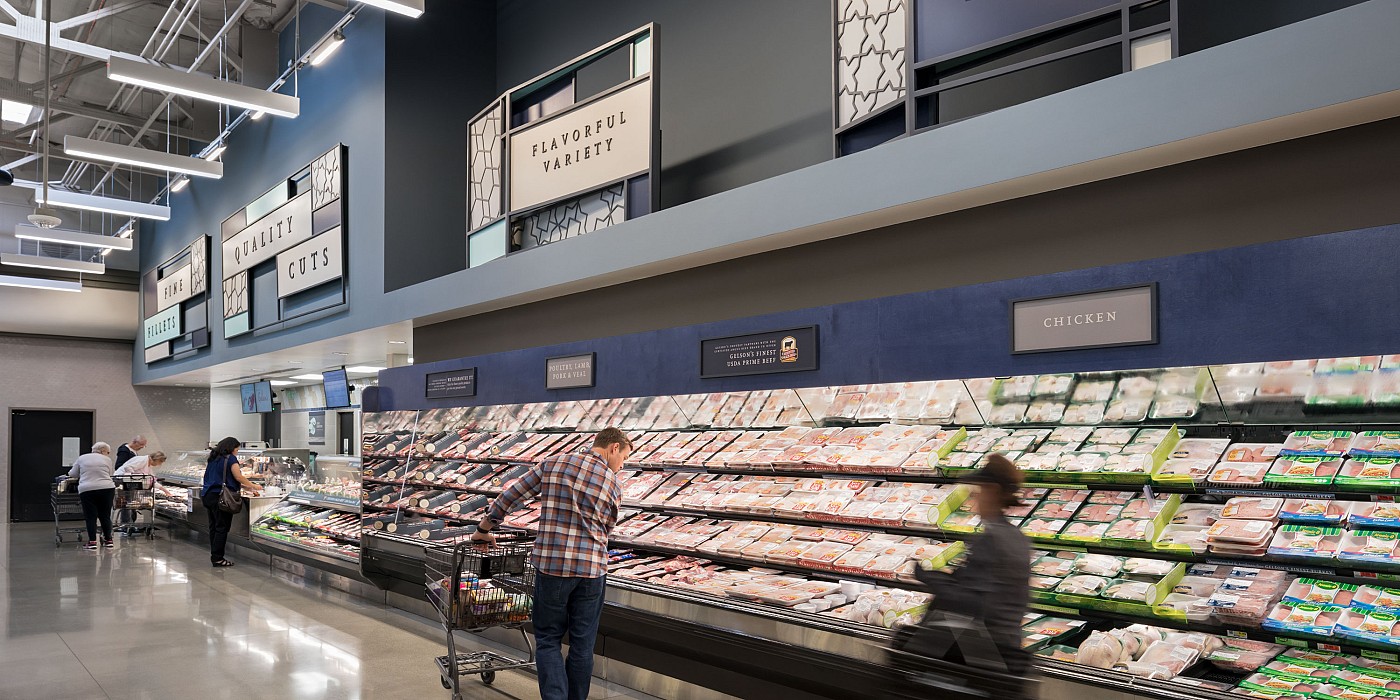
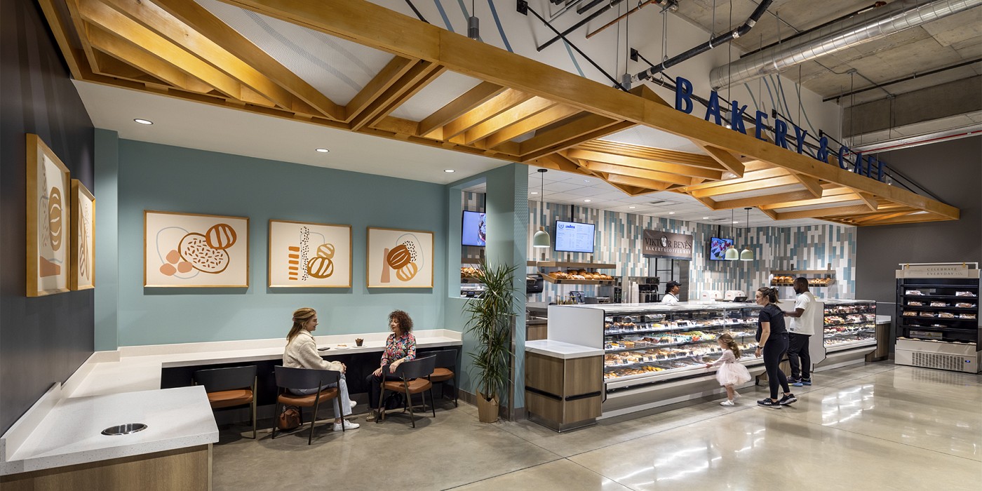
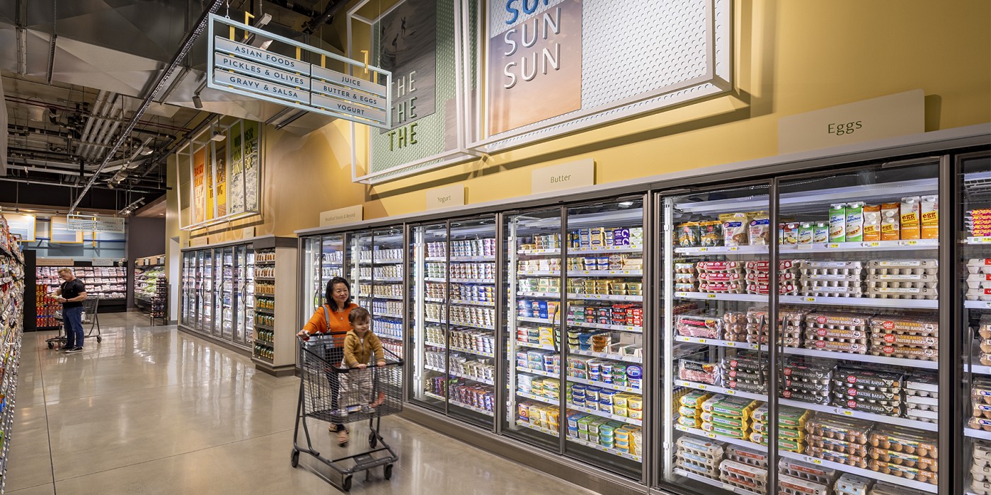
The new Gelson’s identity work was integrated into environmental graphics in the store design (see photos). This work creates a holistic experience that communicates the new brand strategy direction in overt and subtle ways. The Visual Communication strategy in the stores aims to express Gelson’s brand experience while providing opportunities for social activity, taste exploration and food discovery. Visual components leverage imagery and palettes inspired by rolling hills flowing into sandy beaches of the Pacific Ocean together with architectural details pulled from Mediterranean-style Southern California homes. The layered elements communicate an aspirational, casual affluence affirming that “Life tastes better hereSM" while also revealing Gelson’s unparalleled quality standards for curation and inspiring product information.
The new store, store renovations and brand identity, as well as ongoing Brand Stewardship consulting work, are all part of Gelson’s larger brand-building process, which seeks to develop the brand as bringing people together around a shared identity. Gelson’s is a uniquely Southern California brand, which represents and is inspired by a healthy outlook and food culture. Not only is Gelson’s helping people achieve this aspirational Pacific coast lifestyle, but the store also serves as a naturally relaxed setting for these types of behavior. Customers can choose to shop or hang out, either at the dine-in area or the wine bar. And the Gelson’s team is fully dedicated to surrounding that customer with the service and support they need to make for a perfect experience.
